Perfect Properties | A UI Case Study
Real Estate Web Application
Introduction
Finding the right property to invest can be a tedious one, but Perfect Properties Web application has been designed in such a way that it provides its users with all the necessary information on the properties they are interested along with real estate agent suggestions! Users can search for the properties anywhere and get recommended properties based on their unique preferences and also save favorite properties, filter the properties based on requirements and contact the agent. Not just investing, this web application even provides a medium to sell their properties. – Everything is just a click away from your smartphones, tablets or desktops.
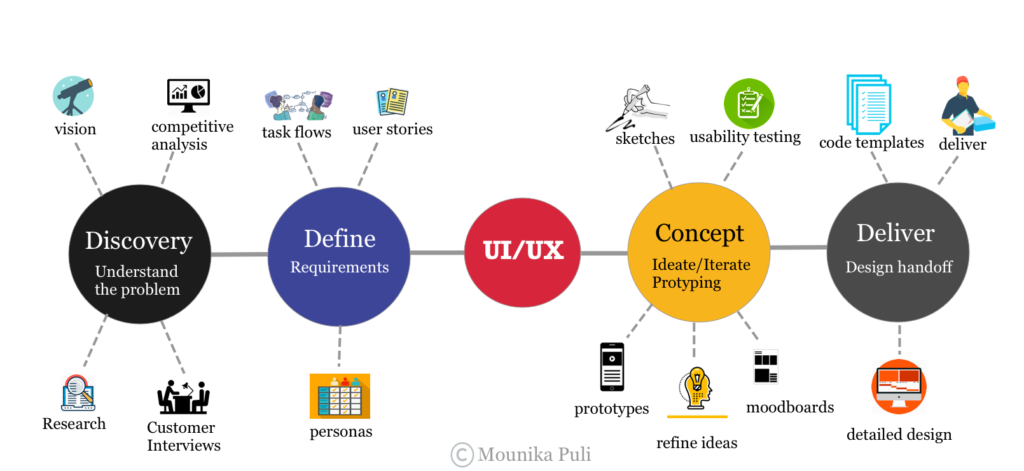
UX Design Process
The Problem Statement
Real estate investment is an increasingly popular way for individuals to achieve financial security. It is an exciting and emotional experience, but often complicated. Often, buyers new to the market struggle to get started without professional guidance and waste time viewing properties out of their range. Users need access to a reliable, uncomplicated information about their potential property investments, able to save the properties and get recommendations based on their unique preferences.
Hypothesis
A responsive web app that allows its users to search for the properties with its enhanced filter tool, save and get recommendations based on their preferences. Users would also get professional guidance from the experience real estate agents.
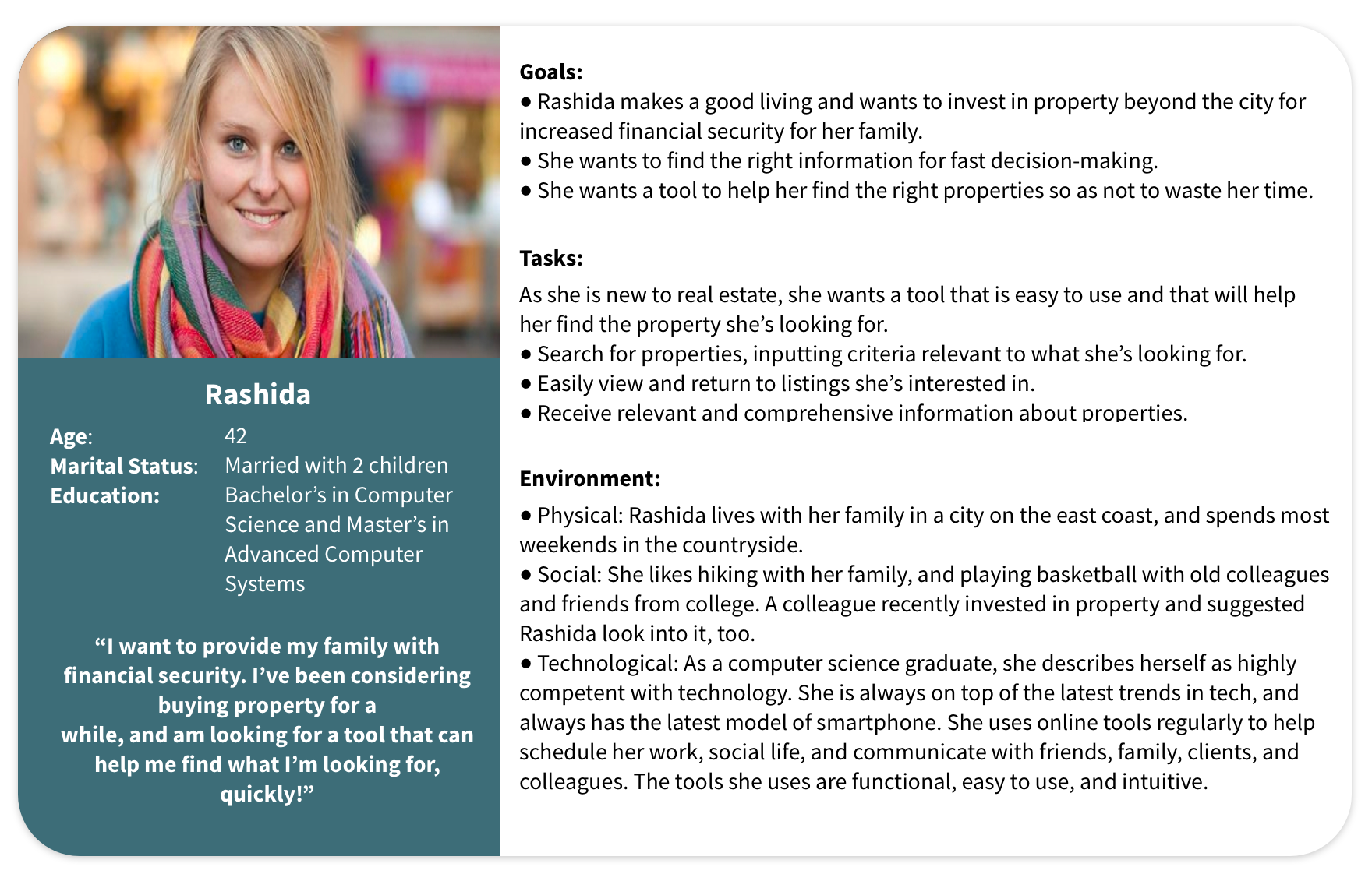
User Persona
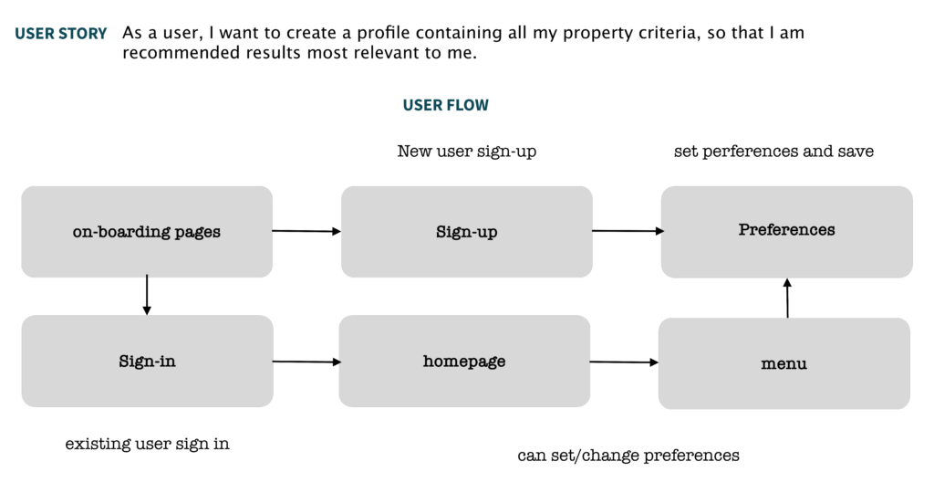
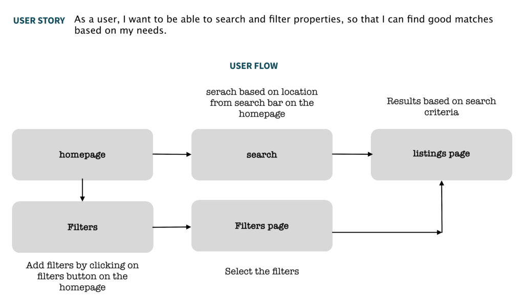
User Stories & User Flows
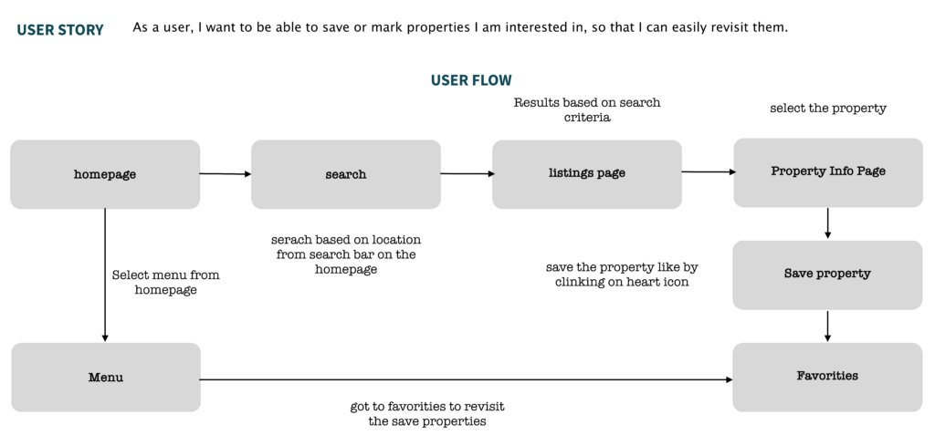
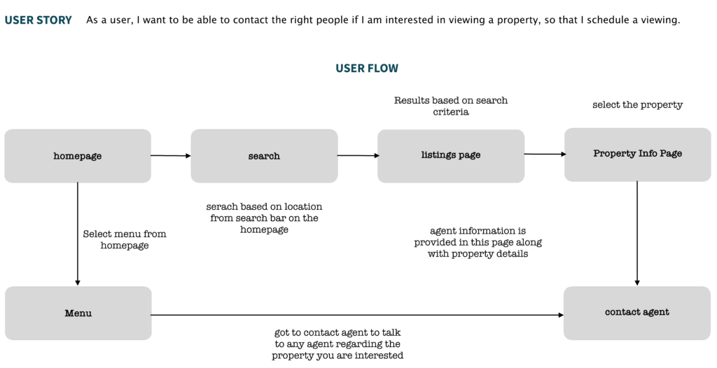
Based on the user persona, user stories and user flows are defined as how would Rashida interact in order to complete a task on the responsive web app. These user stories and user flows allows me to determine what pages I should include in my web app in order for my users to achieve their goals.

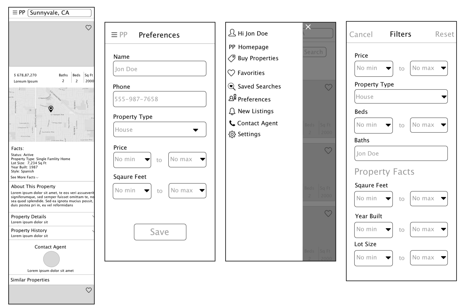
Low - Fidelity Wireframes
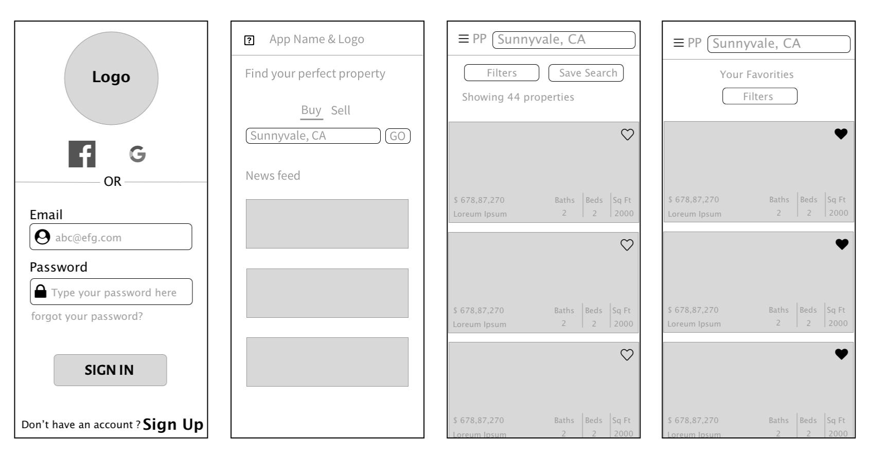
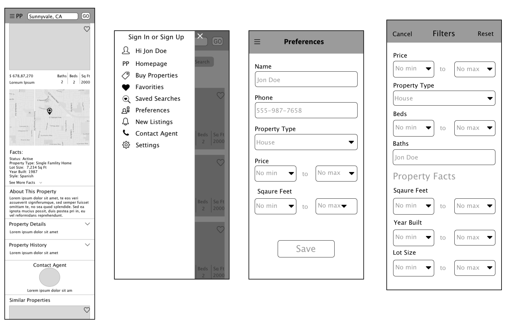
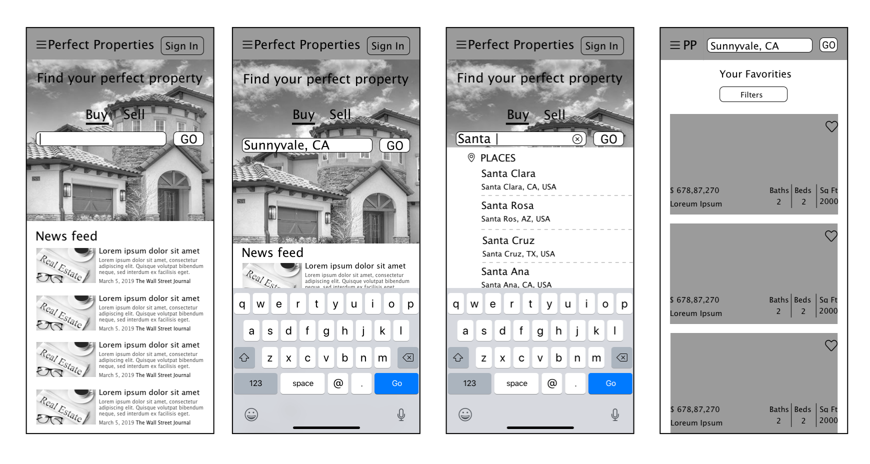
Mid - Fidelity Wireframes
MOODBOARD
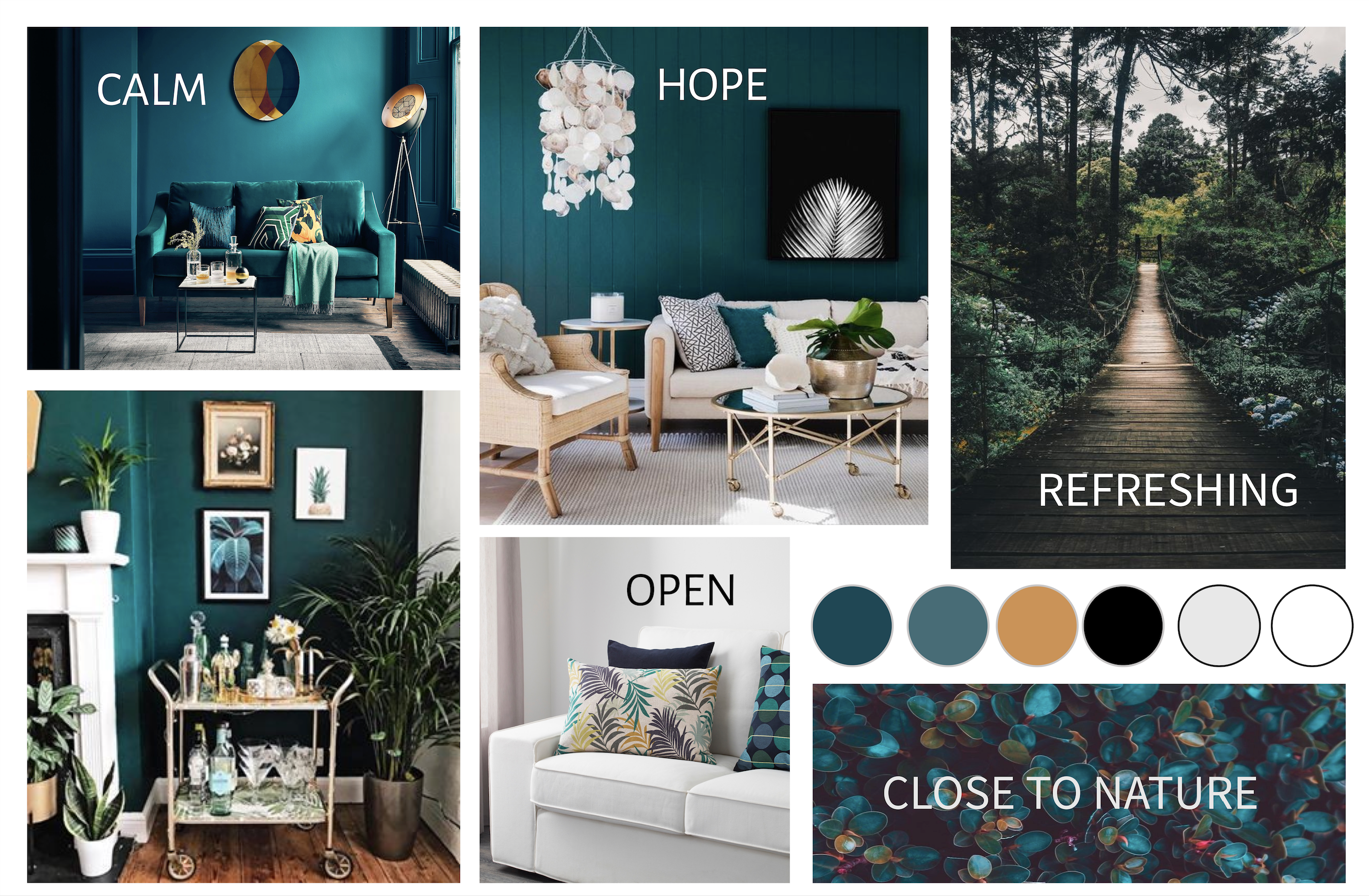
After creating low and mid fidelity wireframes, I made a mood board which helped me to communicate a distinct style and visual direction without needing to spend a lot of time on establishing the screen designs.
Style Guide
After I created the mood board, I put together a style guide to help me transition from mid fidelity prototypes to high fidelity prototypes.
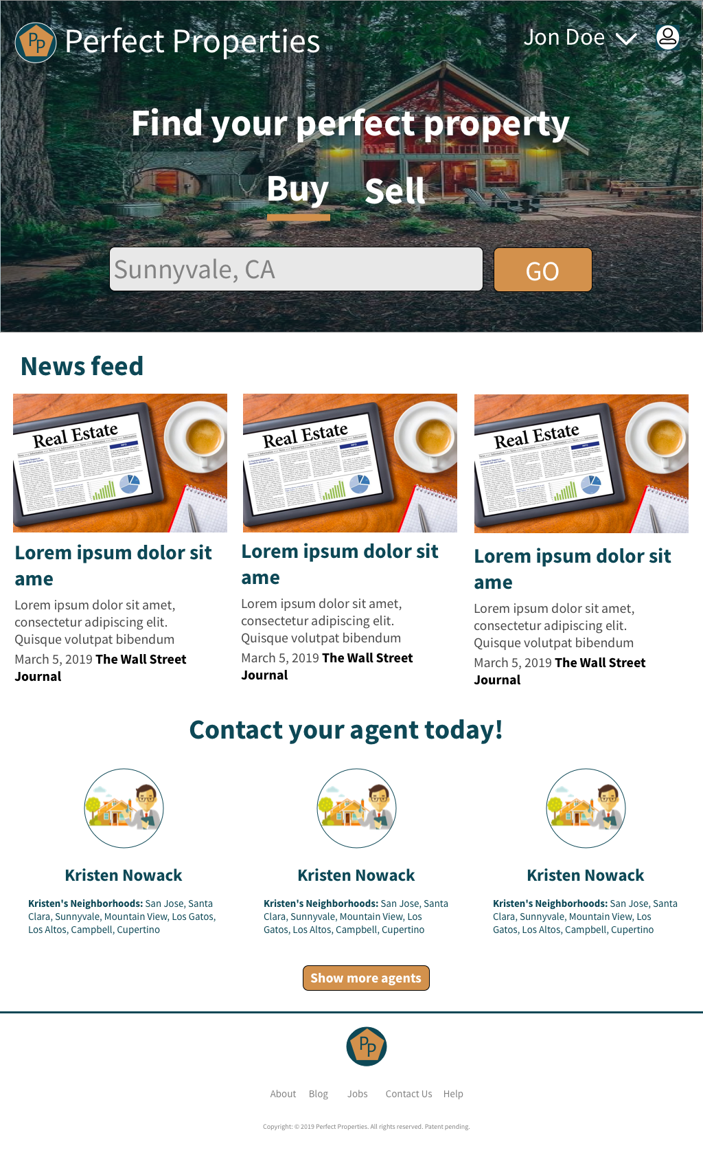
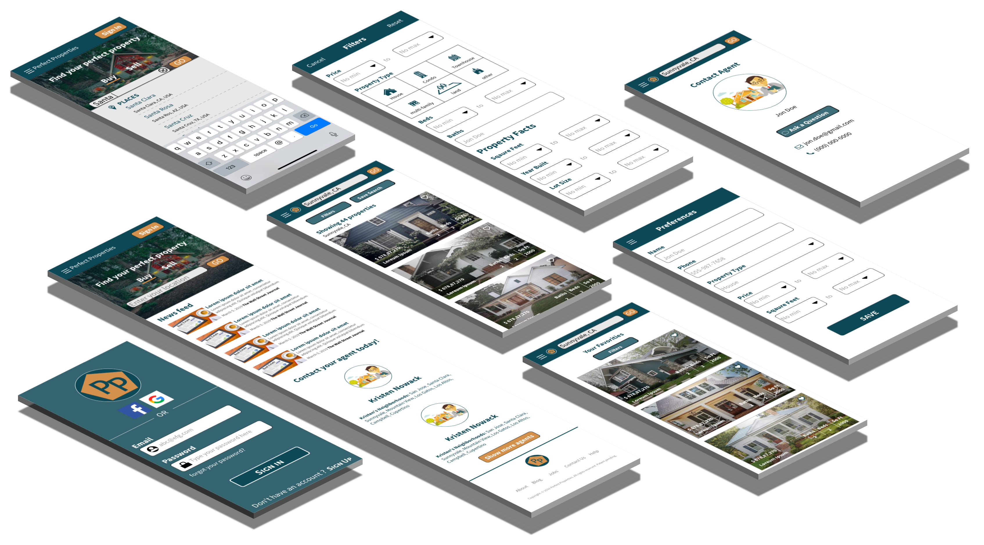
High - Fidelity Prototype
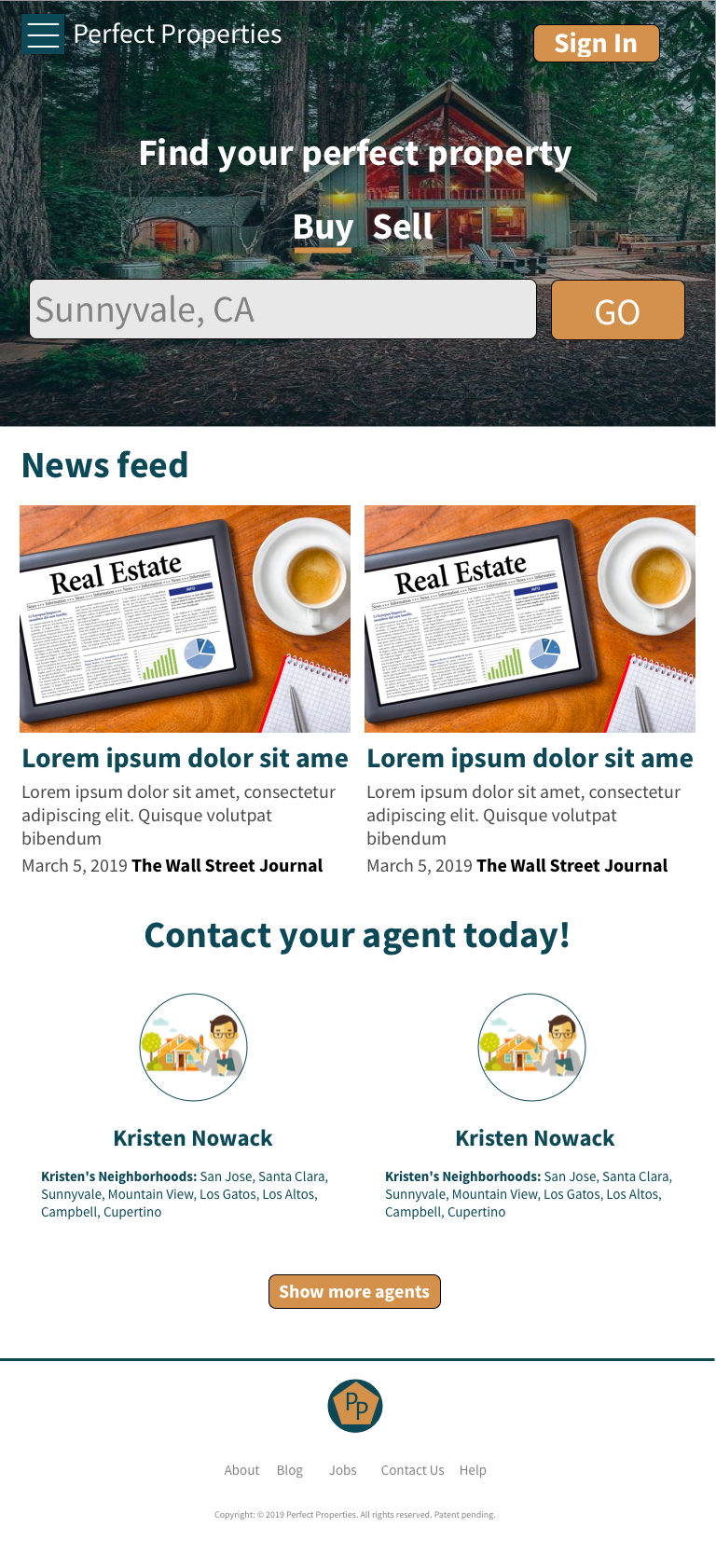
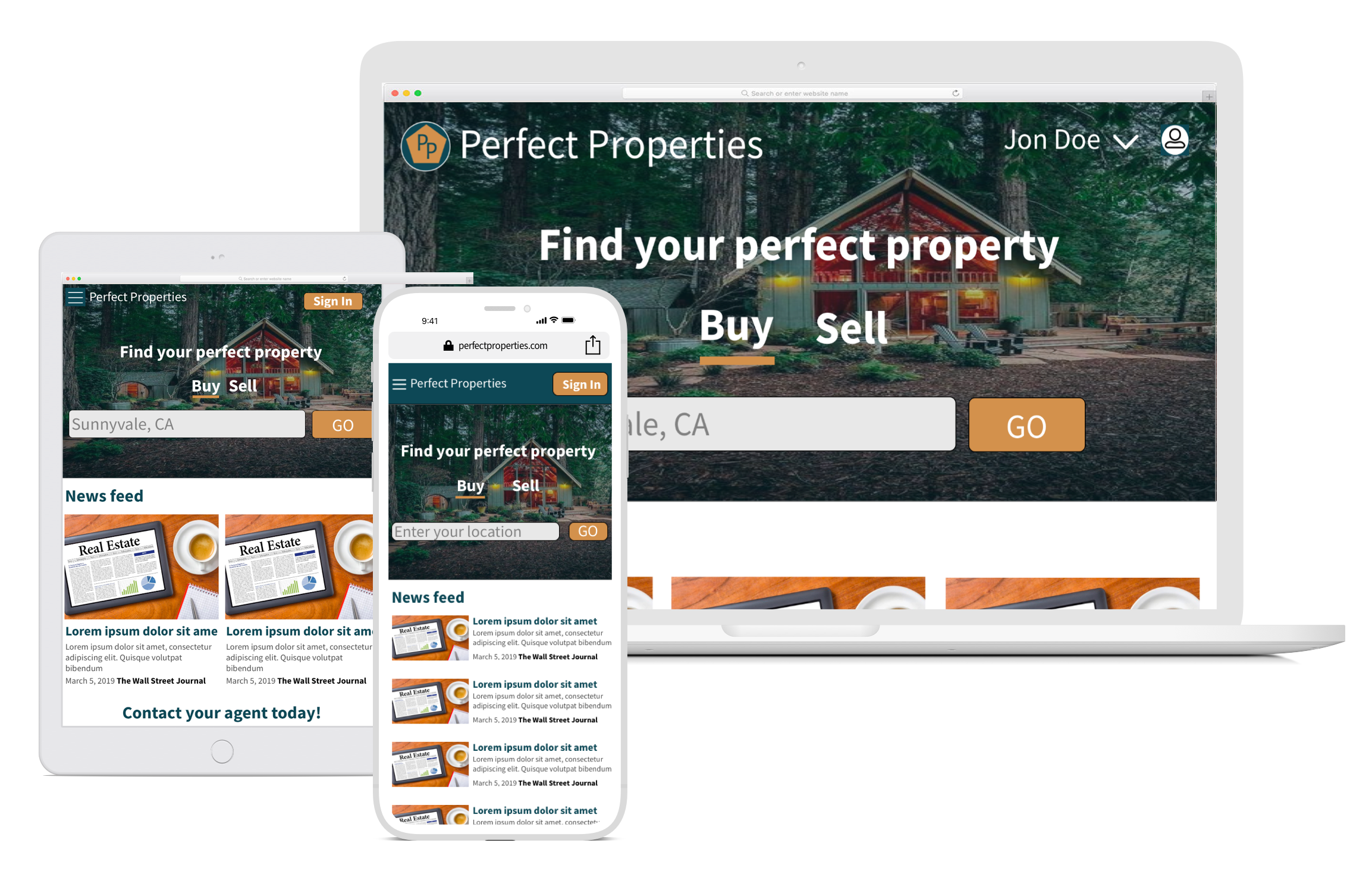
Responsive Wireframes
Conclusion
This was a challenging and enlightening case study to work on. Designing for multiple breakpoints forced me to fully explore principles of responsive design and to implement suggested improvements.
Thanks for viewing!
© 2018 Mounika Puli

