InkTank | A UX Design Project
Tattoo Inspired Application
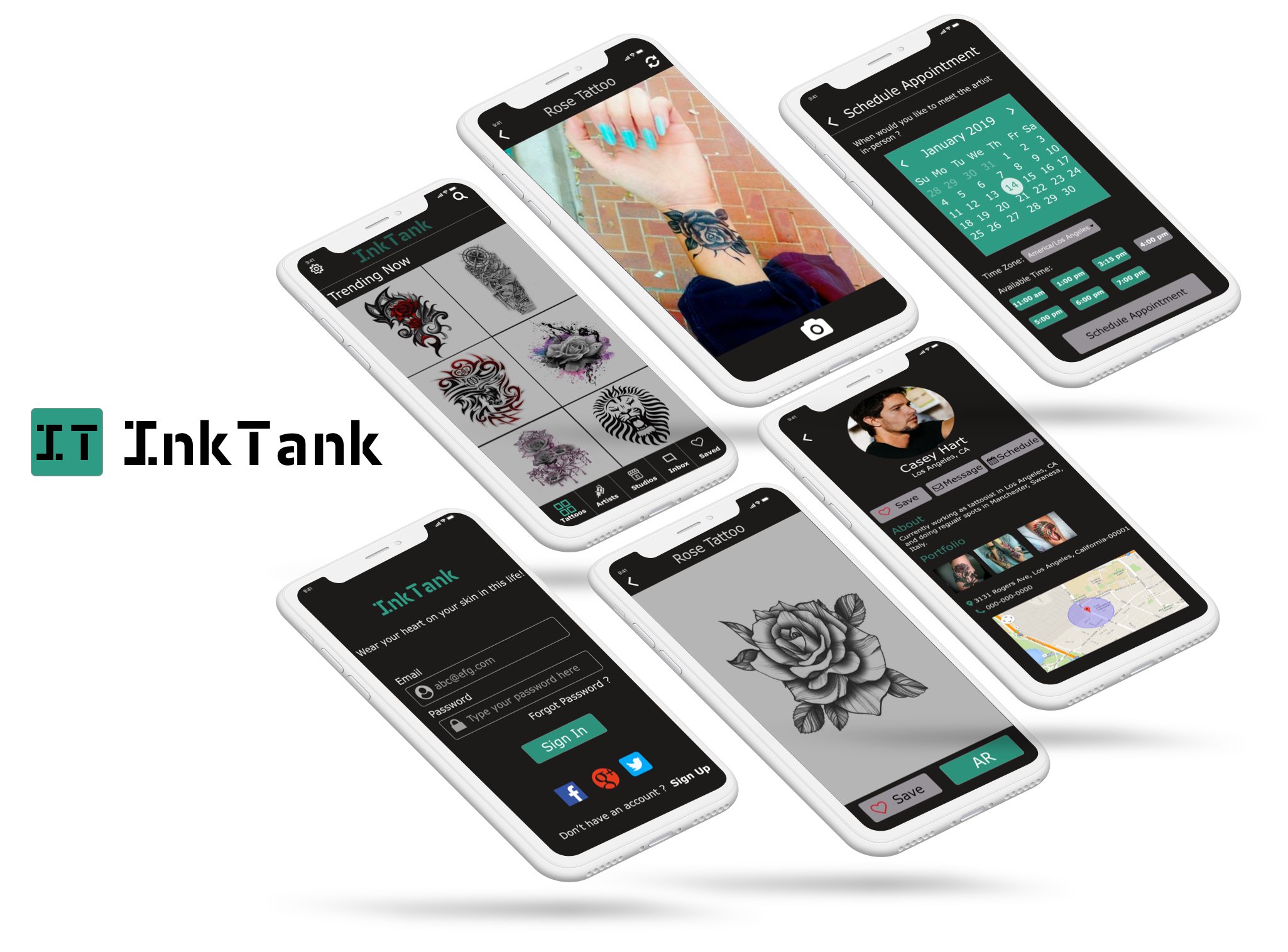
InkTank is an application made to help users find local tattoo artists and studios through an enhanced search feature. This app would allow users to browse through a number of tattoo designs and would allow the user to experience the Augmented Reality (AR) by displaying the tattoo design on their skin virtually. This app would provide users with a platform to chat with artists before scheduling online appointments based on the artist’s availability.
UX Design Process
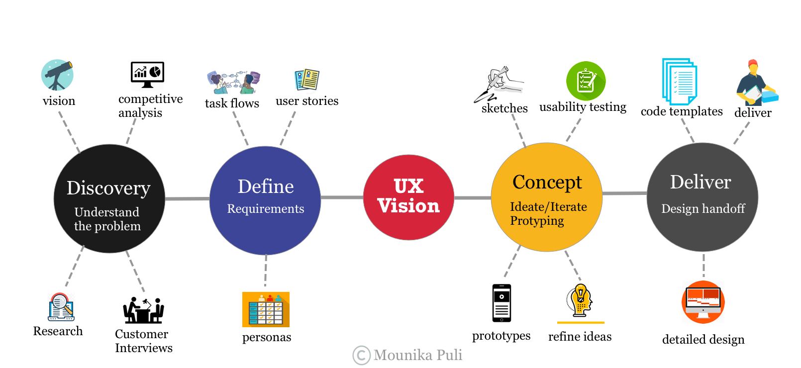
The Problem Statement
Getting a tattoo, especially for the first time, is a cumbersome and difficult process. People interested in getting tattoos need a way to see how the design looks on them before getting inked.
Hypothesis
A mobile app that uses augmented reality to virtually show a tattoo on users’ skin will provide peace-of-mind to tattoo-getters.
Discovery
Tattoodo App


Opportunities:
- An option to view the ones that hearted(liked)
- Improve Search feature
- Schedule appointments with artists
Threats:
- They already have a massive following of millions of people on social media and have 41,000 tattoo artists registered with them.
- Withstanding competition against an established competitor
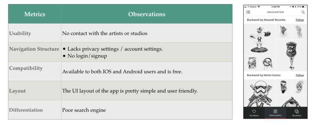
InkHunter App


Opportunities:
- Lower resolution AR
- Upload your own sketches
- Unlimited tattoo designs trail with AR feature.
Threats:
- First Augmented reality Tattoo app with high user ratings
- Withstanding competition against an established competitor
User Interviews
After competitive analysis, I conducted user interviews to validate the idea of my feature listing and to make sure that the app is in alignment with what users actually need. I compiled a set of questions to help me understand the pain points of the users.
90% of the interviewees shared that their main concern was choosing the right tattoo design for them. They do not want to make a mistake that is too expensive to fix. 75% of the users wanted the option to schedule an appointment with artists or studios online. 80% of the users were interested in communicating directly with the artists about their concerns. Based on this feedback received, I went ahead and started laying out wireframes for 3 key features listed below:
- AR
- Enhanced Search
- Schedule appointments online.
Define
Personas
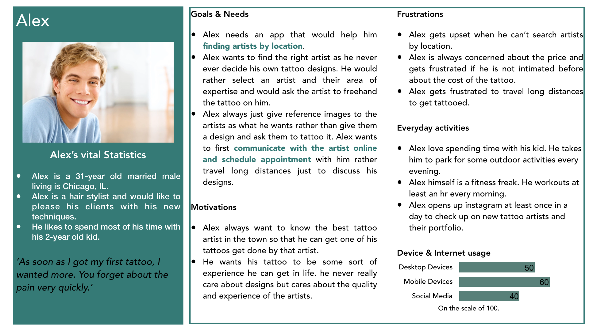
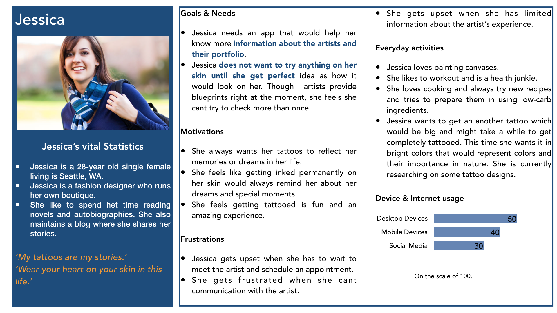
To develop reliable and realistic reference representations of essential user groups, data was used from in-person interviews, remote interviews, and online surveys with people between the ages of 20 and 50 who are interested in getting tattooed.
I developed several user personas and discovered that users need an application to:
- Search for artists nearby and schedule appointments online.
- Improve user confidence in their tattoo selections.
User Journeys
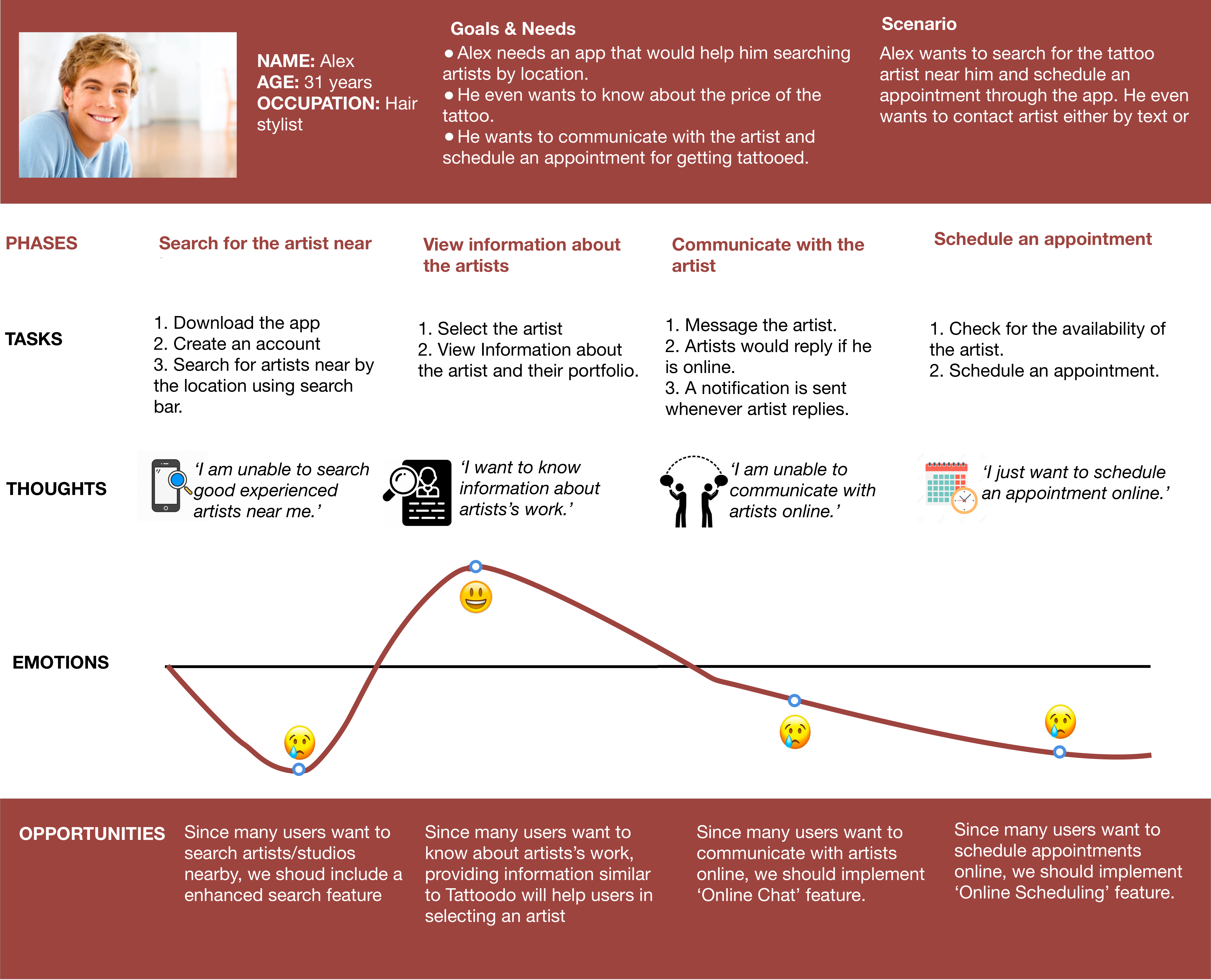
Using the insights gained from the personas, I laid out a journey map based on Alex’s experience of using Tattoodo App.
From the journey map, I was able to determine what content is needed to design toward interaction with artists and scheduling appointments online furthermore the best way to approach it. It provided me with the context of how users see the experience with the existing app services. It helped me identify the stress points such as finding for artists nearby, online chatting and scheduling appointments. InkTank application plans to incorporate these learnings to improve product feature development.
Information Architecture
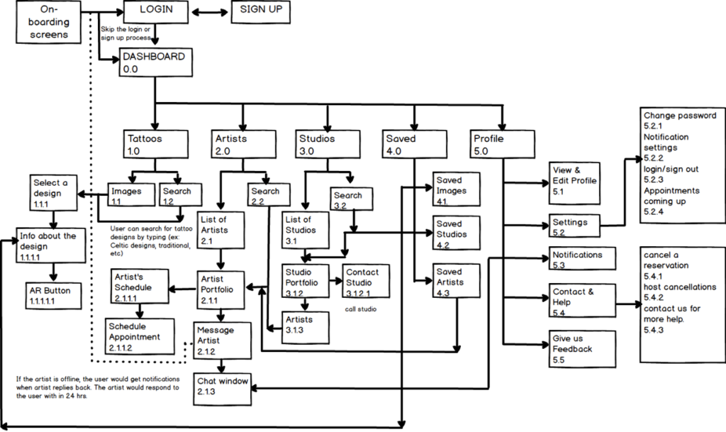
InkTank’s Architecture is created to address personas needs and goals which allow users to browse through a number of tattoo designs and experience the AR feature, chat with artists and schedule online appointments.
I created a sitemap which outlines the hierarchy of InkTank. The sitemap was invaluable when planning out which screens should be sketched first.
User Stories
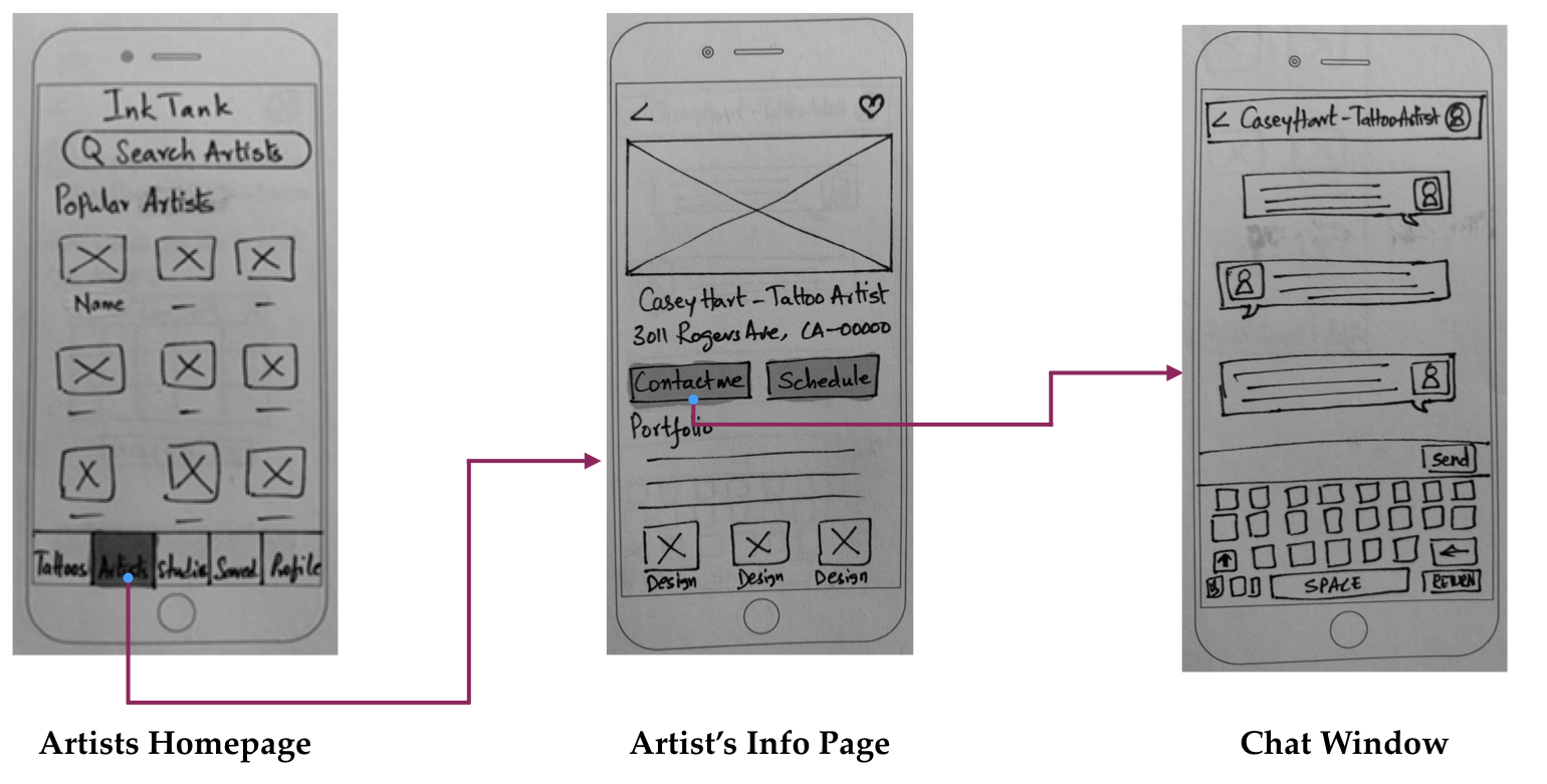
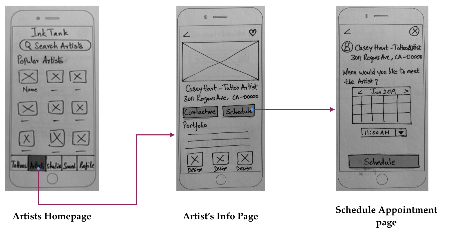
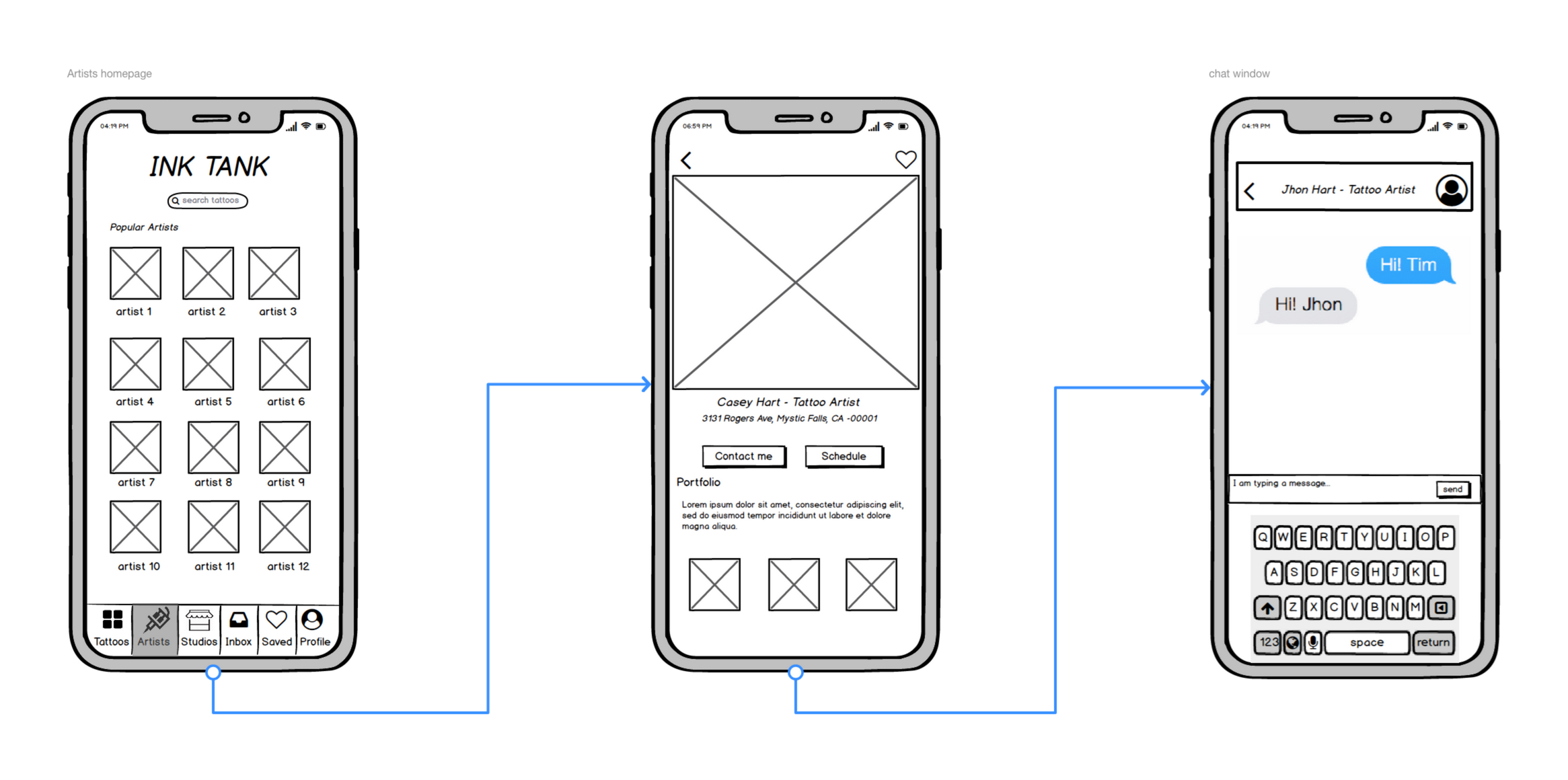
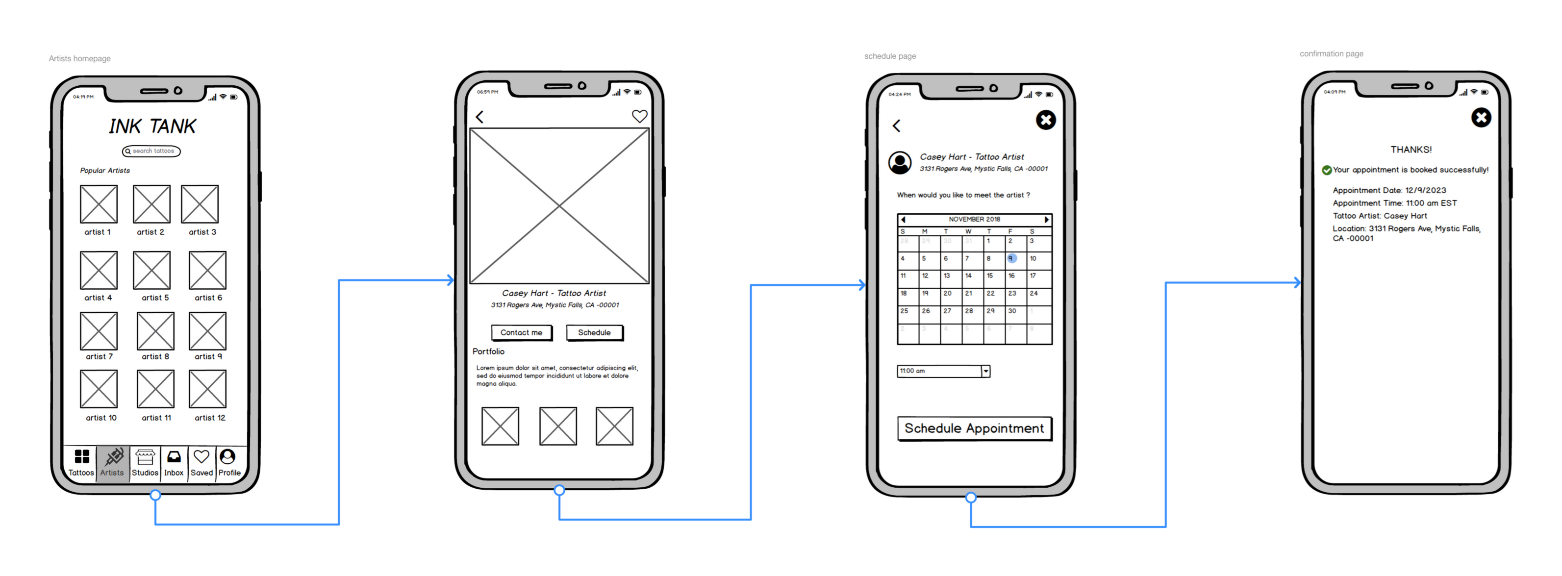
Based on findings from the user research and user personas, I defined two primary user stories to build an MVP (minimum viable product) that addressed InkTank user requirements.
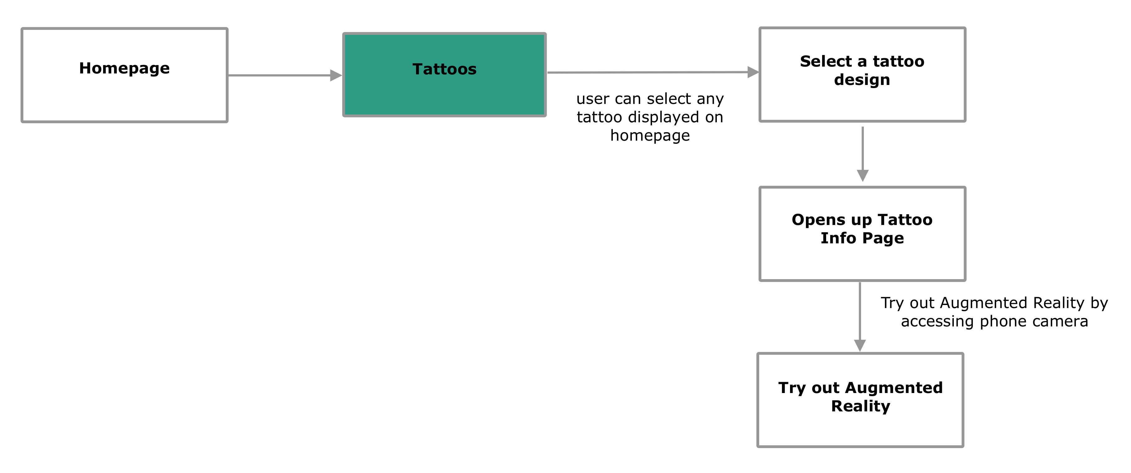
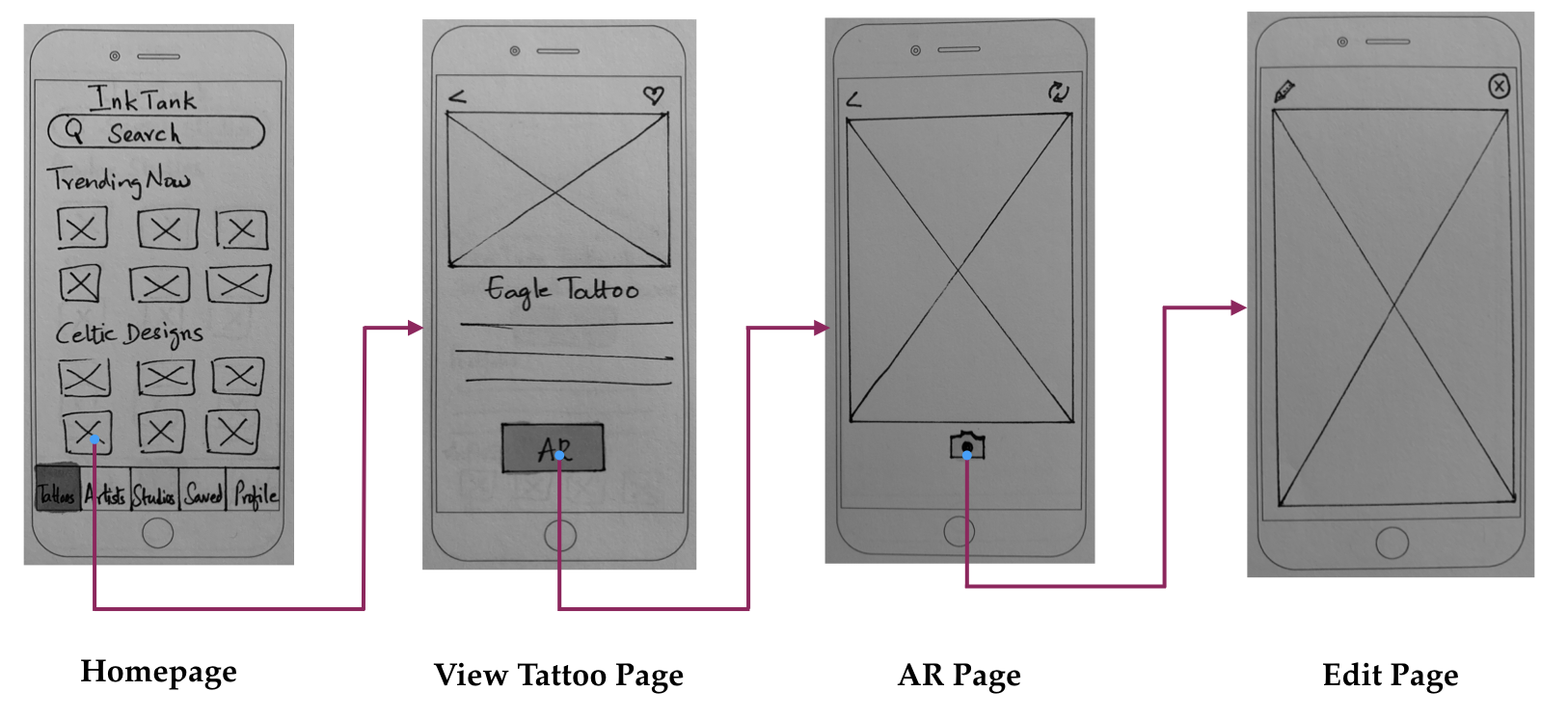
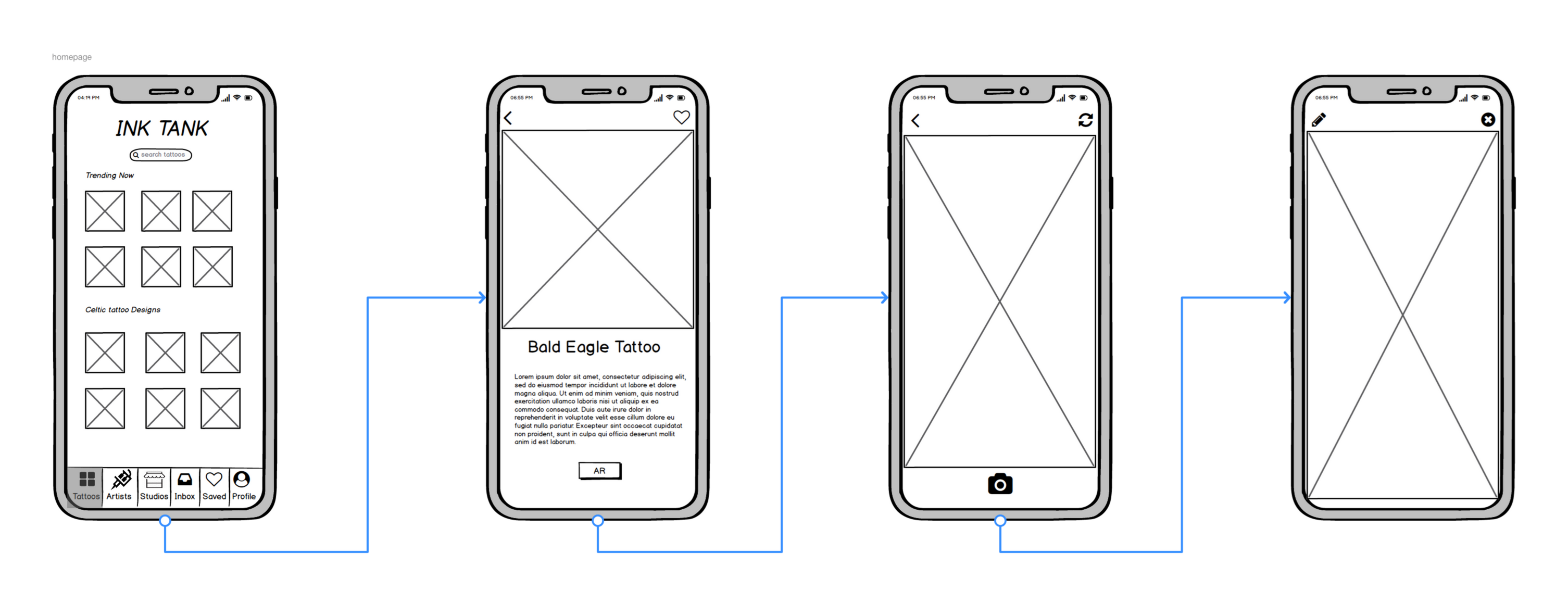
- As a user, I want to try out tattoo designs virtually so that I know how they look on my skin.
User Flow
Low and Mid-Fidelity Wireframes
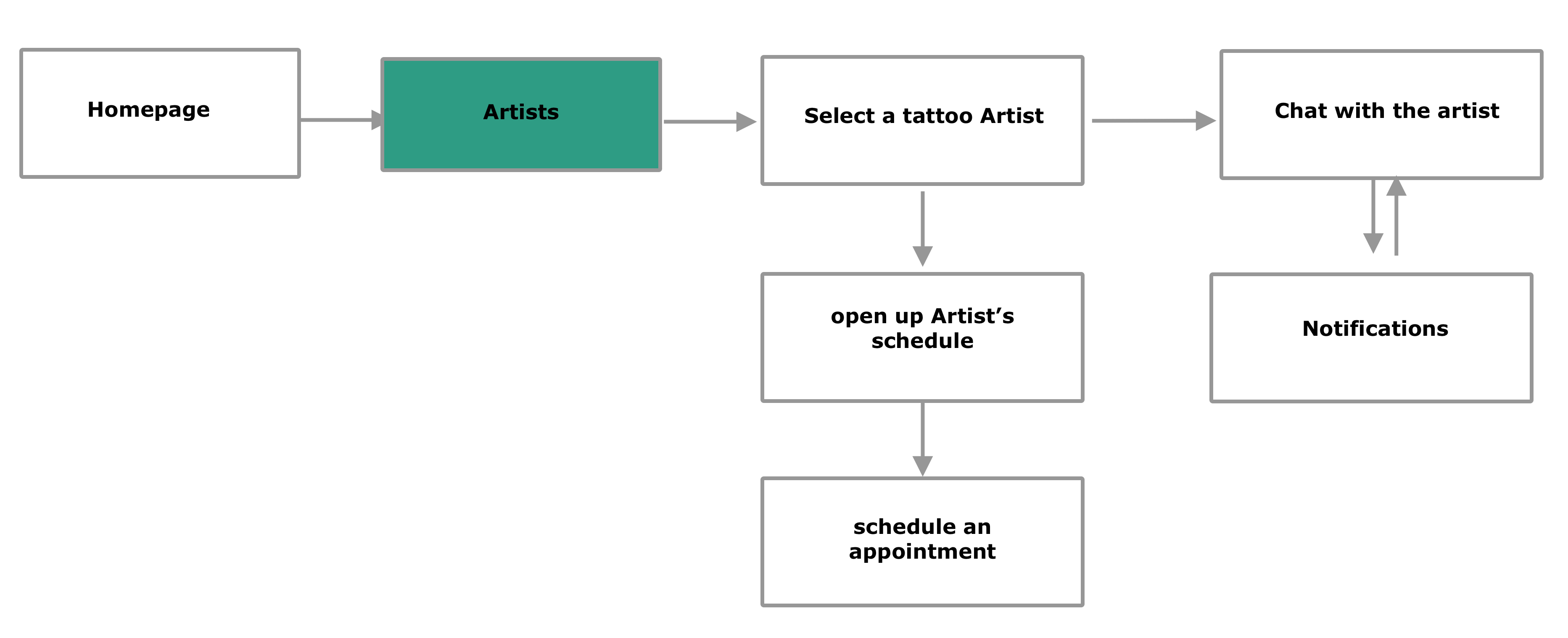
2. As a user, I want to schedule appointments with tattoo artists.
User Flow
Low and Mid-Fidelity Wireframes
Concept
Usability Testing
Top two issues in levels of severity and proposed solutions.
Edit Page
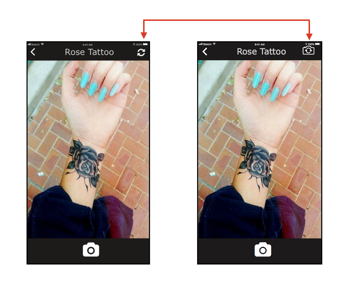
Issue – Four out of six participants felt that a standard front camera icon should be used.
Solution – From the usability testing, we discovered that users got confused with the camera icon. Users thought it to be a refresh icon. So I added a standard camera icon for more understandability.
On-boarding Pages
Issue – Three out of six participants felt that information about the Augmented reality should be more prevalent in the onboarding screens.
Solution – Three users skipped the onboarding process and they did not know AR. The users who completed the onboarding process suggested displaying details of the AR feature on the first screen to attract the user’s attention.
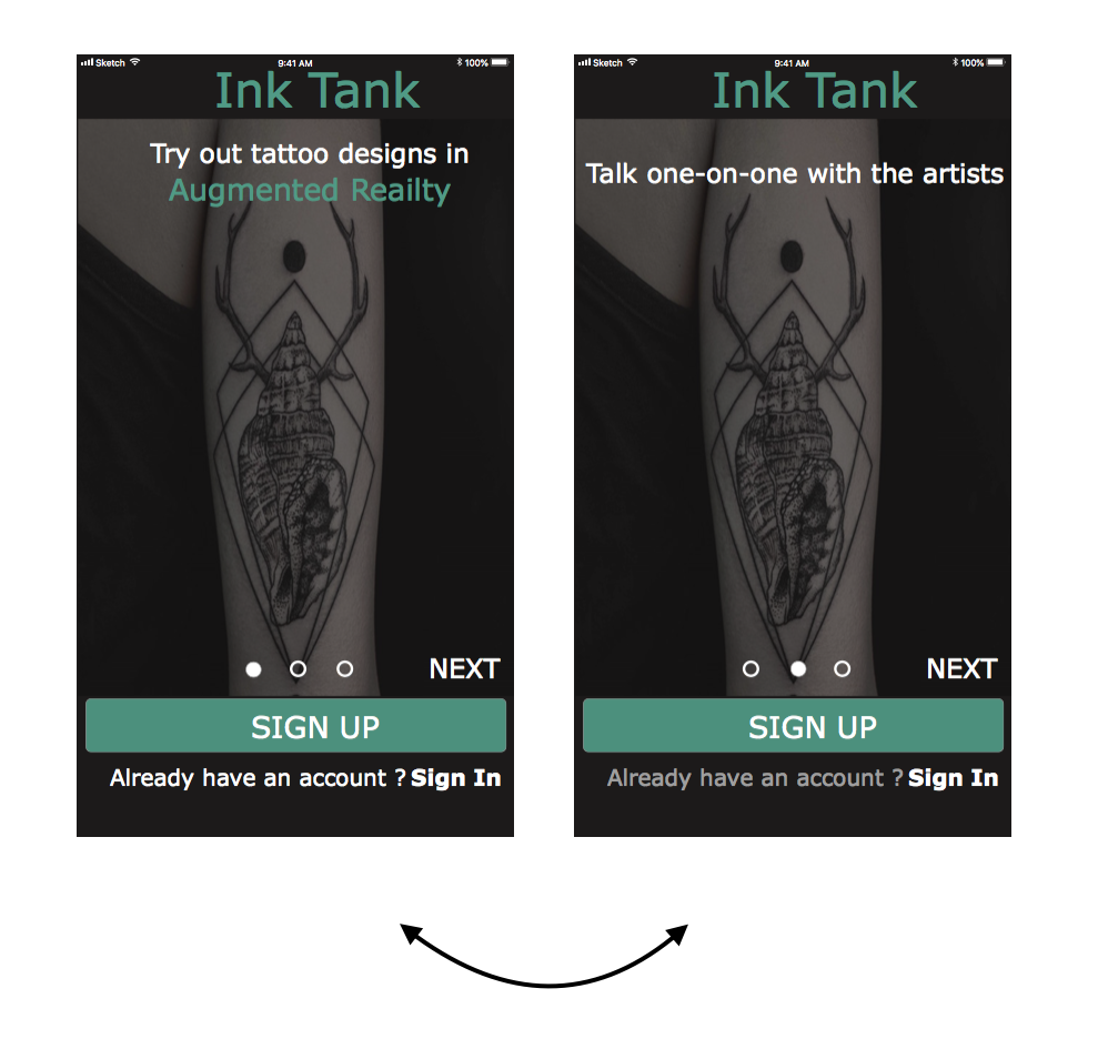
Another session of the testing was conducted with these changes, and users were 100% satisfied with the improvements.
Polishing the Design
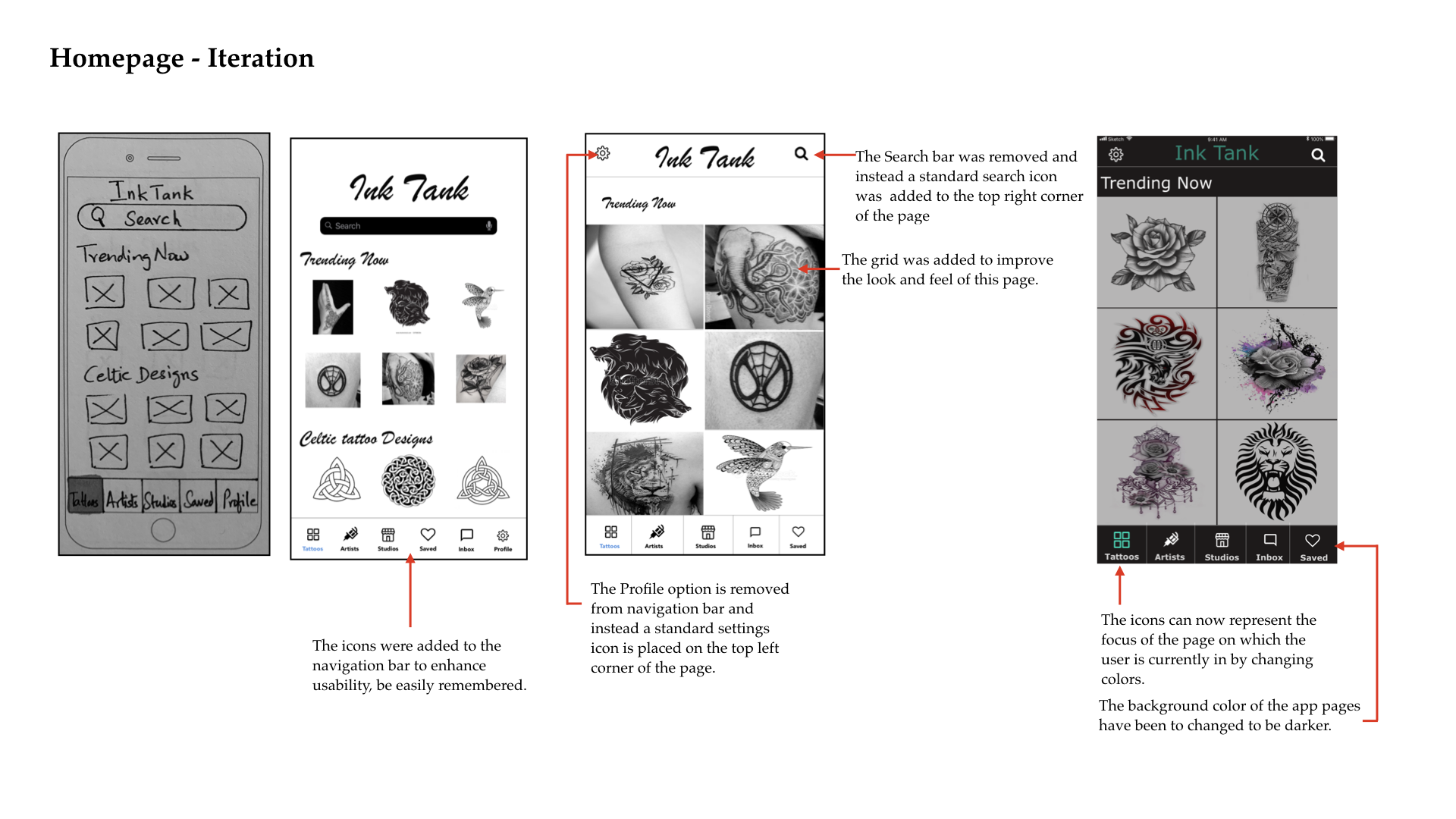
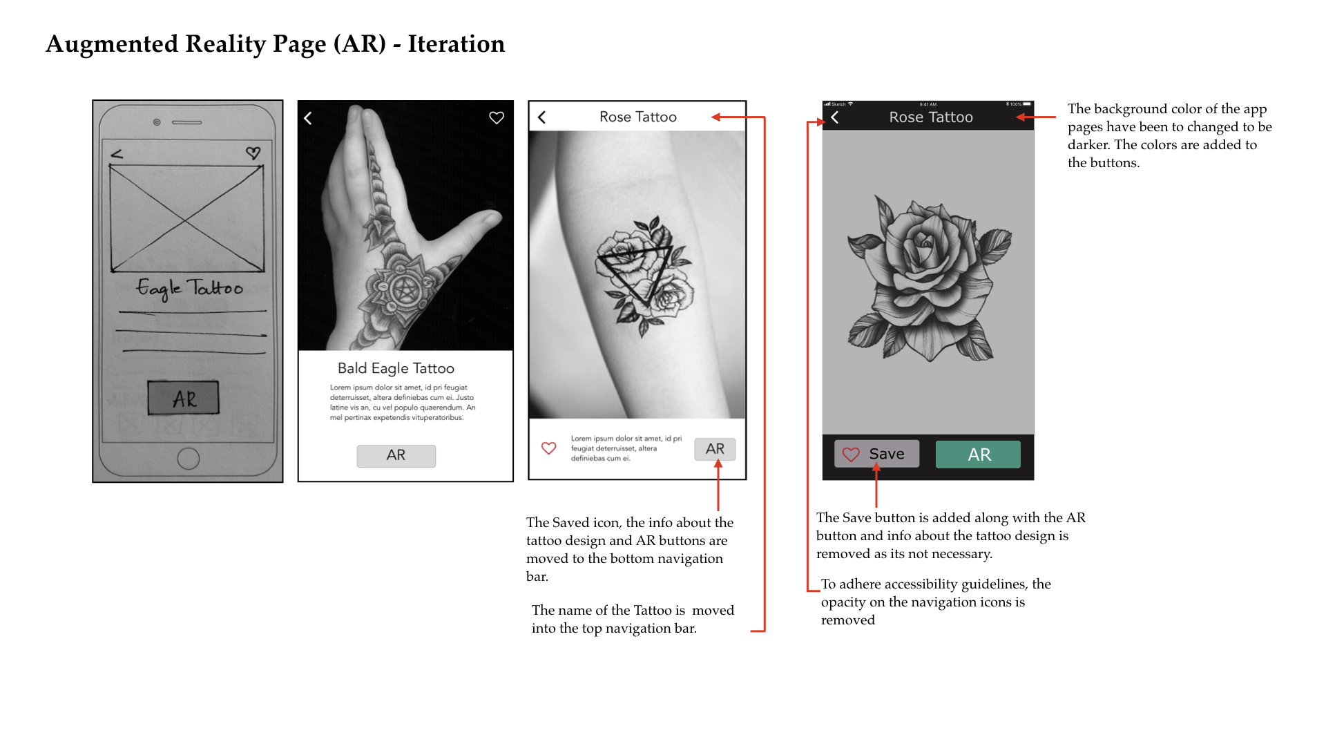
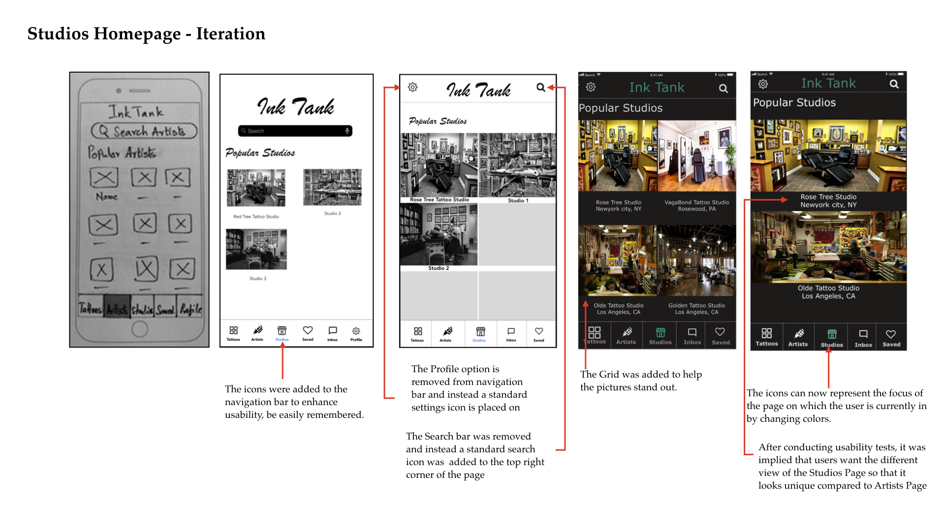
From concept to developer ready files, the UX/UI designs are continuously being improved. The application is tested and evaluated repeatedly at different stages of design to improve usability, readability, and accessibility.
Some of the changes:
- Icons added in the navigation bar to enhance usability and be easily remembered.
- The opacity on the icons and text is removed to improve visibility.
- The Grid is added to stand out the images.
The following shows the process so far.
Deliver
An Interactive prototype of InkTank application is created as close to the true graphical representation of the products as they can to allow thorough testing on all the detailed aspects, including UI components, colors, layouts, the information hierarchy, and other interactions.
High-Fidelity Clickable Prototype
Conclusion
The project’s biggest challenge was to provide a way for users to experience the Augmented Reality feature. Each usability testing gave me an insight into how to make the new AR feature user-friendly. I took into consideration the feedback given by users and many improvements to the AR feature screens such as using standard icons, adding coach marks wherever necessary to help the user understand the next steps. These Iterative user testings and prototyping led to a final product that reduced confusion in the AR design screens by 80%.
The final design of the InkTank Application was successful. During the final round of usability testing, 90% of the users were happy to use the AR functionality. 85% of the users were able to search for artists/studios nearby and 80% of the users were able to schedule appointments with artists online.
Post-MVP, I believe features such as art boards(for users to create their own designs in the app), artists ratings and reviews are next to build.
Thanks for viewing!
© 2018 Mounika Puli